I like it—a matte finish would make it. What colors for the spine and back panel? (Something as simple as black with white text and blue header text might look really good.)
The few colors would go over well with the printer.
I love the title as well, and I think the artwork is evocative and haunting. It works well with the title. I almost wish the title were a little larger, or a little more foregrounded somehow, though.
I think the cover is wonderful. True, people do like color, but that seems a bit populous, no? I'm thinking Picasso's blue period. . .but I suppose other colors could work in an impressionistic sort of way. I find the lines, the shading, the body, the mystique of the color beautiful the way they are.
Paul Guest is the author of four volumes of poetry and a memoir. His debut, The Resurrection of the Body and the Ruin of the World, was awarded the 2002 New Issues Poetry Prize. His second collection, Notes for My Body Double, was awarded the 2006 Prairie Schooner Book Prize. His third collection, My Index of Slightly Horrifying Knowledge, was published by Ecco Press/HarperCollins in 2008. His fourth collection, Because Everything Is Terrible, was published by Diode Editions. His poems have appeared in Harper's, The Paris Review, Poetry, Tin House, The Kenyon Review, and elsewhere. His memoir, One More Theory About Happiness, was published by Ecco in May 2010 and selected for the Barnes & Noble Discover Great New Writers Program. The recipient of a 2011 Guggenheim Fellowship and a 2007 Whiting Writers' Award, Guest lives in Charlottesville, Virginia.


10 comments:
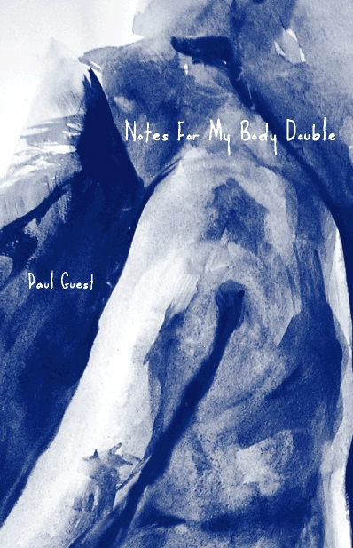
Paul: Great title! I'd buy the book just for that. Only wish the cover were more colorful.
I like it—a matte finish would make it. What colors for the spine and back panel? (Something as simple as black with white text and blue header text might look really good.)
The few colors would go over well with the printer.
It will be a matte cover, regardless of whatever art the cover becomes...
I love the title as well, and I think the artwork is evocative and haunting. It works well with the title. I almost wish the title were a little larger, or a little more foregrounded somehow, though.
It's somber. And the cover of your first book is also somber. Haven't we learned anything from Billy Collins? Color sells!
Seriously, I like it. But, like LAR, I hope the title will be foregrounded. It's a kick-ass title.
Yeah, I agree with the folks who want to see the title more prominent. Maybe a text-box type thing? Because it is a terrific title.
I'd also like to see a little more color on the cover, a little more warmth - and I agree with making the title more bright or noticeable.
Hot
Paul, I think it's very loevely, but I think Anne's suggestion is a good idea. The title is too nice and polite. You want to to grab the reader!
Either a text box or moving the title to the upper left, with darker, bolder type. That's my 2 cents.
I think the cover is wonderful. True, people do like color, but that seems a bit populous, no? I'm thinking Picasso's blue period. . .but I suppose other colors could work in an impressionistic sort of way. I find the lines, the shading, the body, the mystique of the color beautiful the way they are.
Post a Comment